By David Ponce

You guys spoke, and we heard you. For those of you with no clue of what I’m talking about, I’m referring to this article where we announce that no one won our T-Shirt design contest. Many of you pointed out that it wasn’t fair to those who worked hard at these designs, and that even if we don’t end up using any of the submissions, we should at least reward someone for their work.

You’re absolutely right.

So, big apologies are in order. We never meant to cop out of anything, and certainly didn’t mean to make you guys work with no intention of rewarding anyone. It was an error in judgment on my part, and I’m really sorry. At the time, it seemed to make sense, but looking back, it was stupid.

So, without further adieu, I’d like you guys to hit the jump so you can look at everything that came in, and vote on a winner. I’m not placing names next to the submissions, simply because someone might take offense. If you want to claim your work in the comments, you’re free to do so. To vote, simply leave a comment for your favorite.

And, finally, we’re aware that many of these are really cool. We didn’t decide to not use any (double negatives, eh?) because they all sucked, at all. We just wanted a little more. And thanks so much for everyone who entered.

[ Update: I’m aware that #11 and #1 are dupes. Further proof that yours truly is retarded. ]

Entry #1

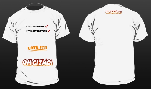
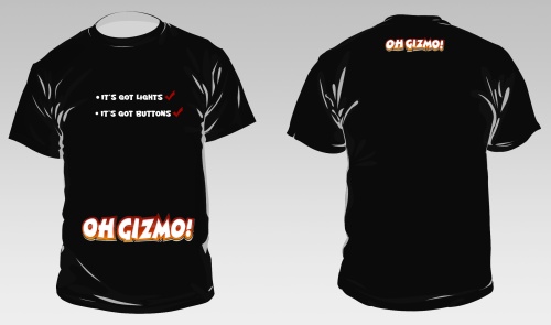
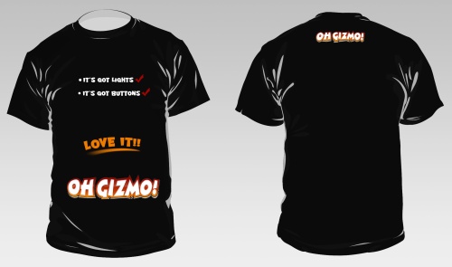
Entry #2
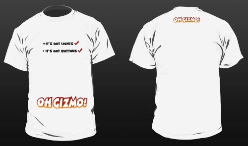
White T, no \"Love It!\"

White T, with \"Love It!\"

Black T, no \"Love It!\"

Black T, with \"Love It!\"

Entry #3

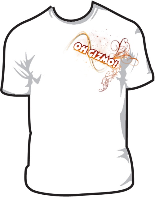
Entry #4

Entry #5

Entry #6
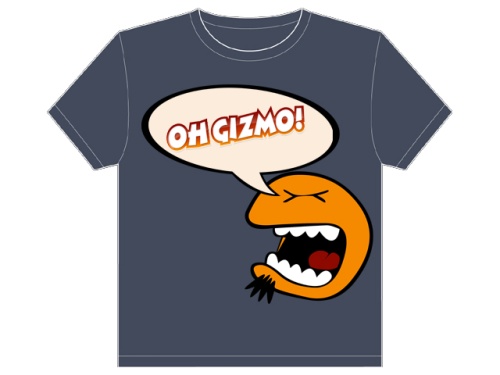
Entry #7

Entry #8
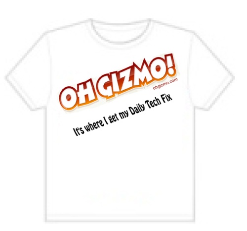
Entry #9
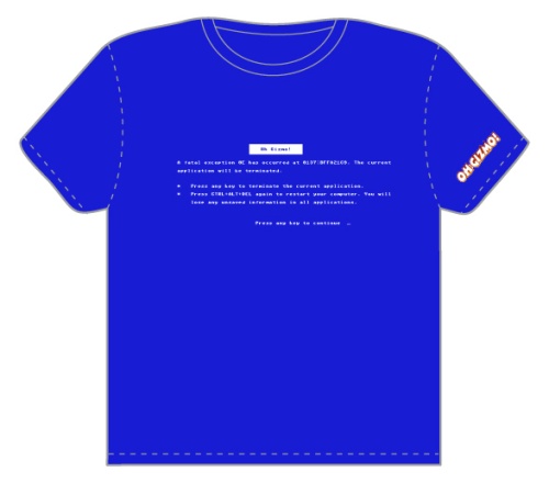
Entry #10
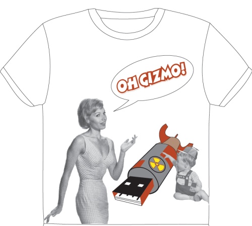
Entry #11
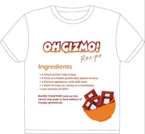
Entry #12
Entry #13
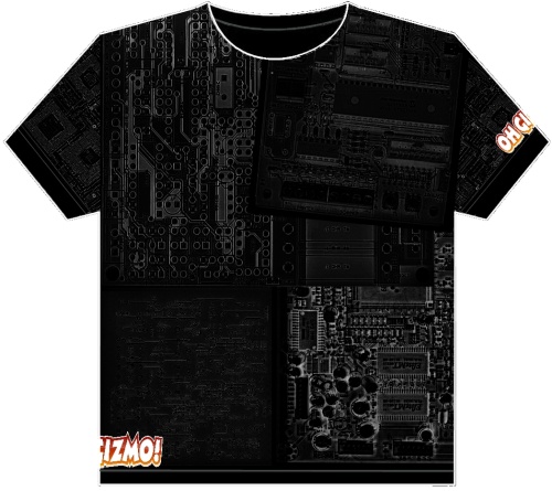
52 COMMENTS

  1. Number 13 without a doubt. It’s classy, not busy and gets to the point in a simple way. A real great job on that to the artist. How much $$?

  2. Honestly, I agree with David Ponce in that none of them are really good but if i had to pick the least horrible one ill go with 13. The rest are just plain and boring.

  3. The life of all graphic artists™ begins at the copy© machine®
    “command/copy ~command/paste” ~bo-ring~

    Maybe you could have given more design parameters? Queries? Purpose?

    Also,.. Up the ante’. I didn’t even give this contest a second glance.

    Love the site though!

  4. agree with josh and his comments – and i’d go with 13 too.
    however, the practacality (is that a word?) of printing that shirt at a decent price to be able to sell it, is probably out of the question…

  5. i run a t-shirt design contest on my own website so i should know what would sell best. And i would go for number 4 ik like it, it’s by far the most beautiful shirt on the page. The only thing is i dont know if it could be screenprinted because you can’t use gradients then and only a number of collors (usually six and a white base color beneath al that.) but whatever i’m rambling, just typed this whole post on my iphone like a real gadgetfreak should 😉

  6. Bugger that. You’re a neat gadgetry blog aimed at geeks with high disposable income who like flashing lights. You need something based on this:

    http://flickr.com/photos/leahbuechley/2326630769/in/photostream/

    and you need to be aiming at low volume/high value eyecandy rather than disposable polycotton.

    So, maybe you could have a 2×3 grid which spells out OHGIZMO in Braille at intervals and measures ambient light levels the rest of the time. I like that because people would have to understand Braille to read it but it isn’t Braille because you can’t feel it. But it’s not very gizmoid; spell it out in ASCII or something. But do it in lights, not clip-art.

    Here’s the kit: http://www.arduino.cc/en/Main/ArduinoBoardLilyPad

    (Disclaimer: they’re nothing to do with me. But if you make a shirt with cool lighting effects people will actually wear it in public once they’ve bought it.)

  7. I’d say 13 is the best but I did notice that nobody tried to redo style of the Ohgizmo logo. That’s the first thing I’d do however I didn’t really read the rules as it may have been mandatory to leave that as is.

    Anyway yea, 13 is a good start and I’d wear that shirt without the goofy logo on it.

  8. I wouldn’t wear any of them either, and I don’t think any of them reflect the feel of Oh Gizmo.
    My vote would go to #4, but I wouldn’t actually purchase it.

  9. I wouldn’t buy any of them… but if I had to choose, I would go with #4. Clean and to the point but not very exciting. Some of these are horrible.

  10. You were so righ. These SUCK! If I was forced to choose, it would be a toss up between #3 & #6.

    Oh and #5 looks like a scary buff drag quees that want’s to kick your ass. Never would sell.

  11. Please, run the competition again, but allow minor changes to the logo. I’m an amateur Digital Artist, but I don’t want to have to work around it.

  12. .
    ..

    i am proud of your decision, david.

    now, not only do you come out a good-guy, but the rest of us have to endure the torture of these designs.

    since none of these will ever be made into a shirt….ever….i will choose entry # 13 for it’s concept.

    ..
    .

  13. To the owner of OhGizmo!: I feel bad that everyone gave you a hard time for not picking a winner. Your original winner (“no one”) deserved the win! They are all poor designs.

  14. I just wanted to point out that #7 are two seperated designs the bottom one should be viewed from a distance(its a kind of gadgertry). Everyboddy seemd to be forgotten that it should be in 5 colours (mine are due the use of (overlaying) rasters) so maybe that counted with the desion to pick none to. cheerio i vote 7 offcourse 🙂

  15. I wish I came to this site sooner…. I would have definitely participated. I kinda understand though why none of these were picked. Poor designs in my opinion. Number 8 is HORRIBLE TYPOGRAPHY… My vote is for number 4.

LEAVE A REPLY