By Andrew Liszewski
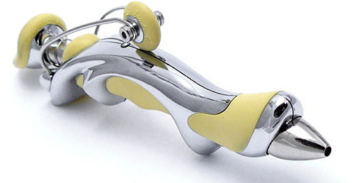
I enjoy a clever bit of industrial design as much as the next guy particularly when form closely follows function but I’m struggling to see why this ballpoint pen designed by Jean Pierre Lepine looks so utterly complicated. Here’s the description of the Free Ride pen from the JOON New York website that doesn’t help much:
The Free Ride is designed to be different, ergonomic, and fun. This push top ballpoint features a soft rubber like material in the vital sections where finger meets pen. The arched hull is held in place by hand drilled screws. As Lepine puts it, “I create tomorrow’s writing instruments for today’s men and women”.
I can understand the need for an ergonomic pen since “today’s men and women” have to deal with the strain of signing their name 3 or 4 times a day on computer generated documents but what’s with that wheel on top? I assume it’s a clip of some sort but would anyone really walk around with this hanging off their shirt?
Surprisingly though when it comes to ‘designer’ pens the Free Ride isn’t that expensive. It’s available in green, blue, red, orange and yellow colors for $175 but I would suggest going for the chrome finished version instead which adds about $15 to the cost.
[ Free Ride Ballpoint Pen ] VIA [ Crave ]