If you’re reading this it’s because we’ve finally launched our new design. We’re really excited about it: OhGizmo! has looked the same since October 2007, so we were due for a change. We hope you like it too because really, what we think of it doesn’t matter. At this point we’re really hoping for your input, and your debugging abilities and anything you can throw our way.
We don’t have the kind of budget that would have allowed us to do a fancy redesign, with all the bells and whistles other sites have these days. Then again, sometimes bells and whistles ends up being overkill, so maybe this is good. We just wanted a cleaner, fresher look with less clutter, less ads and a more easily navigable site. And with an emphasis on images. Also, we have almost 13,000 articles in our database and while some items look old and outdated today, others stand the test of time and are worth reading about a second time. Or even a first time for a majority of you who are unlikely to have ever seen them. There’s gold in there and we’re trying to help you guys find it.
So anyway, listed after the jump are all the changes and some of the reasoning behind them.
The entire site is 1,110 pixels wide. This was a hard decision from the start since it meant that around 8% of our readers would now not be able to fit the whole thing in their window and would have to scroll. But we felt it necessary to inconvenience this 8% to please the remaining 92%. The idea was that we wanted more room for images, more room for navigation. Screen resolution is going up across the board, what with Retina displays hitting the market. And while some of you could say we could have done a flex design, layout constraints prevented us from going that route. The truth? We have to fit some ads above the fold (and pay our bills) and a flex design makes that hard.
The main post window is now 760 pixels wide, which means images will be around that size whenever possible. Right now they’re 500px wide so it’s a 50% increase.
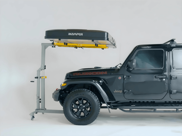
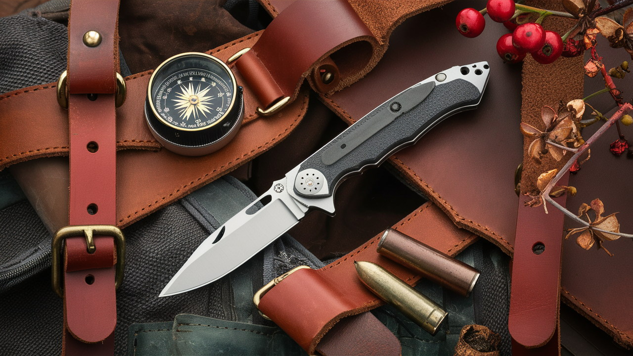
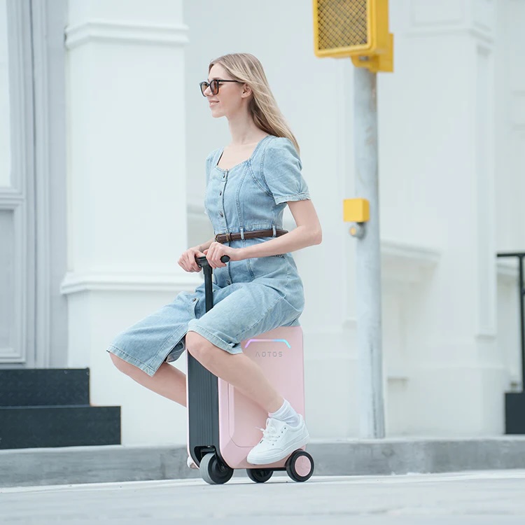
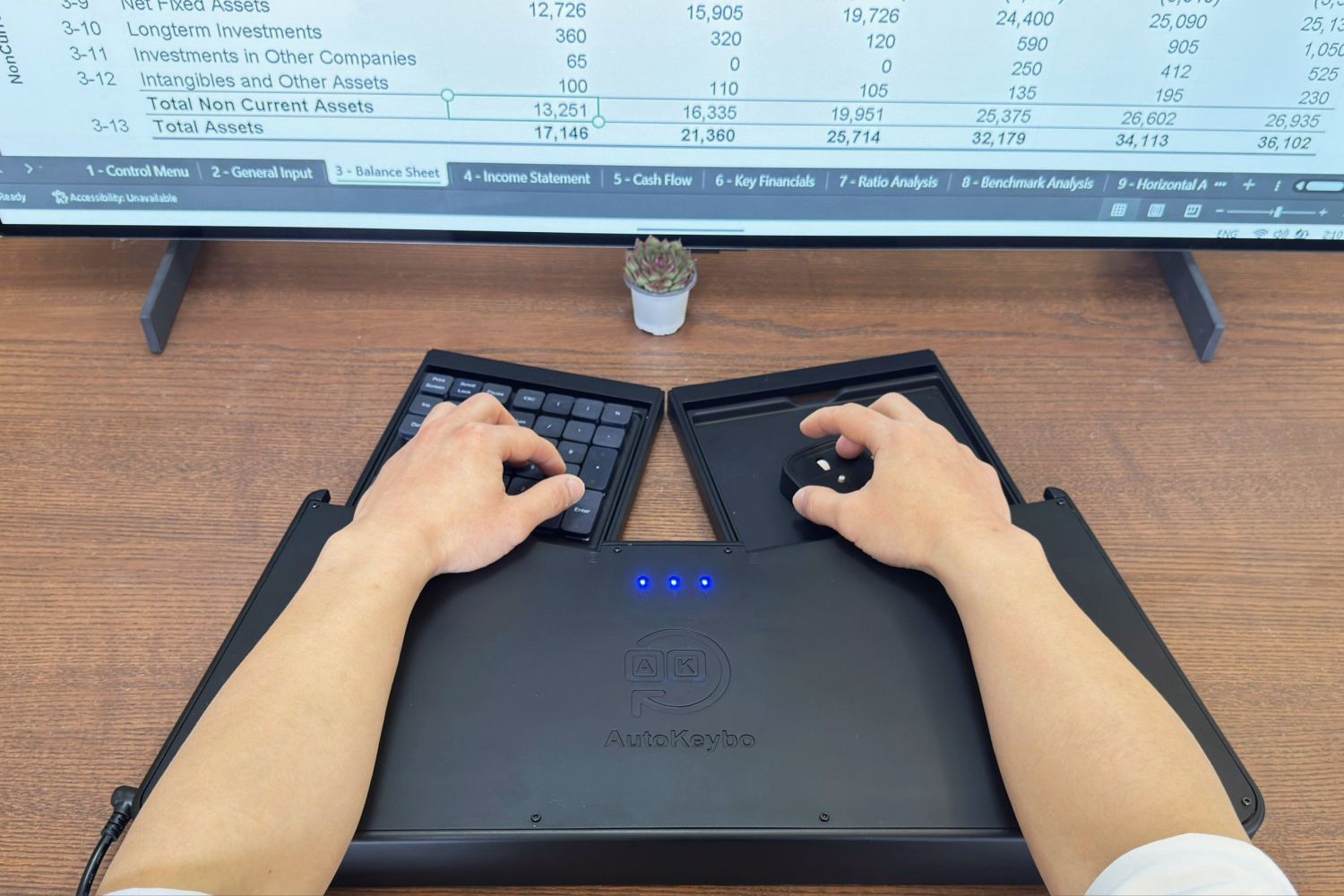
We added four “Featured Posts” at the very top of the homepage (but not the permalink page). These will be random posts from the archives, or anything we feel needs highlighting. Again, the idea is to ease and encourage navigation.
There’s a “Recent Posts” widget in the sidebar, which is more useful when you land on a particular article rather than when scrolling down from the homepage (where you can very well see for yourself what the recent posts are).
Within a specific article (the permalink page) there are two panes above the article that point to the story immediately before and after the one you’re reading.
Sandwiched between the comments and the article is a series of thumbnails pointing to “Related Articles”. We don’t know how strong the algorithm is for relatedness, but it’s there anyway in case it works well.
And that… really is it.
Obviously there’s a colour change. We’re hoping it’s easier on your eyes, while still retaining a bit of a classic black text/white background thing going on.
Also, we’re not at 100%. There are still some things that will get done over the next day or two. Like Archives. Turns out we have too many articles in the database, so the plugin we liked for the archives won’t load. Also we’re playing around with social button implementation. We believe less is more, so it’s not about how many we put but rather where and what they look like. But it should all be sorted out within a day or two.
In the meantime, comments are welcome. Criticism is welcome. Anything, really.

